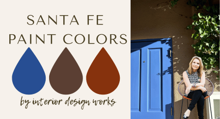
Capturing Santa Fe: A Color Consultant’s Guide to Adobe-Inspired Palettes
As a color consultant, I’m always on the lookout for inspiration. Recently, I took a fall trip to Santa Fe, New Mexico, and found myself immersed in a kaleidoscope of earthy tones and vibrant accents. The city, with its adobe-style architecture and breathtaking landscapes, is like walking through a painting. Every corner seems to whisper stories of heritage, art, and the seamless blend of nature with design.
The Inspiration: Santa Fe’s Signature Style
Santa Fe is famous for its adobe homes, which seem to grow organically from the land itself. These buildings, with their soft golds, warm tans, and sunbaked clay tones, embody the earthy palette of the Southwest. The magic lies not just in the primary hues but also in the harmonious contrasts—the way soft whites, sage greens, and vibrant turquoise doors punctuate the warm bases.
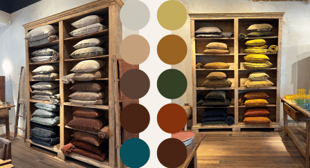
Let me walk you through the palette I put together to capture the spirit of Santa Fe. Whether you’re designing a home exterior or simply dreaming of the Southwest, these colors offer warmth, balance, and timeless charm.

The Base: Adobe Earth Tones
Santa Fe’s architecture is grounded in colors pulled straight from the earth. These tones create a warm, inviting foundation:

Golden Ochre: Reflects the soft glow of a New Mexico sunset.
Warm Tan: Like the desert sand after a light rain.
Clay Red: Evoking the richness of sun-dried adobe bricks.

The Neutrals: Soft, Warm Whites
Forget cool, stark whites—Santa Fe teaches us that warmth is key. The whites here have a touch of creaminess, perfect for blending with earth tones:
Bone White: A soft neutral with subtle warmth.
Alabaster Cream: Adds a touch of elegance without stealing attention.
Sand Dune Beige: A versatile, barely-there tone that complements the bolder colors.
The Depth: Softer Blacks
Pure black is rare in Santa Fe’s palette. Instead, muted, warmer blacks add depth without harshness:
Charcoal Brown: A rich, smoky tone that works as a trim or accent.
Deep Umber: A soft black with brown undertones, ideal for shutters or railings.
The Accents: Pops of Vibrancy
Santa Fe’s charm shines through its unexpected accents. These pops of color breathe life into the earthy base and bring energy to the space:
Turquoise Blue: Inspired by traditional jewelry and clear desert skies.

Sage Green: Reflecting the muted tones of desert plants.

Periwinkle Purple: A nod to the vibrant artistry seen in local textiles.
Marigold Gold: A cheerful, sunlit accent that pairs beautifully with adobe tones.
How to Use This Palette for Your Home
Bringing a bit of Santa Fe to your home exterior isn’t just about the colors; it’s about creating a feeling. Start with a foundation of adobe-inspired earth tones for walls. Use soft whites for trim to keep the look fresh and timeless. Add a touch of personality with colorful accents on doors, shutters, or window frames. For a truly authentic Santa Fe vibe, consider incorporating natural textures like wood and stone.

Drawing inspiration from Santa Fe’s distinctive adobe architecture and vibrant accents, here’s a curated selection of Sherwin-Williams paint colors that encapsulate the city’s unique charm:
Adobe-Inspired Earth Tones:
- Kilim Beige (SW 6106): A warm beige reminiscent of sunbaked adobe walls.
- Latte (SW 6108): A deeper tan reflecting the rich, earthy hues of the Southwest.
- Cavern Clay (SW 7701): A warm terracotta evoking traditional adobe bricks.
Warm Whites:
- Alabaster (SW 7008): A soft, warm white that complements earthy tones.
- Shoji White (SW 7042): A creamy white with subtle warmth, ideal for trim and interiors.
Soft, Warm Blacks:
- Urbane Bronze (SW 7048): A deep, bronzed brown offering a sophisticated alternative to pure black.
- Porpoise (SW 7047): A warm, dark gray with brown undertones, providing depth without harshness.
Vibrant Accents:
- Calypso (SW 6950): A lively turquoise reflecting the iconic Southwestern turquoise jewelry.
- Periwinkle (SW 9065): A soft, muted blue-purple adding a touch of whimsy.
- Svelte Sage (SW 6164): A subdued sage green reminiscent of desert flora.
- Basil (SW 6194): a Darker shade of green that captures the evergreens.
- Goldfinch (SW 6905): A bright, cheerful gold capturing the essence of Santa Fe’s sunny ambiance.
These selections aim to bring the warmth and vibrancy of Santa Fe’s aesthetic into your home, creating a harmonious and inviting atmosphere.
Walking through Santa Fe this fall, I was reminded of how much color shapes our experience of a place. The city’s palette isn’t just beautiful—it tells a story of history, art, and harmony with nature. Whether you’re designing a new home or refreshing your exterior, consider this palette as a way to bring warmth, vibrancy, and timeless charm into your design.
Designing with colors like these is more than a style choice—it’s a way to connect with the essence of a place. And in this case, Santa Fe’s nod to the beauty of the desert.
Looking for a paint consultation?

LEAVE A COMMENT
Comments